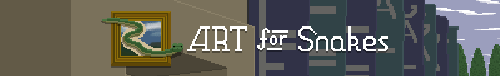
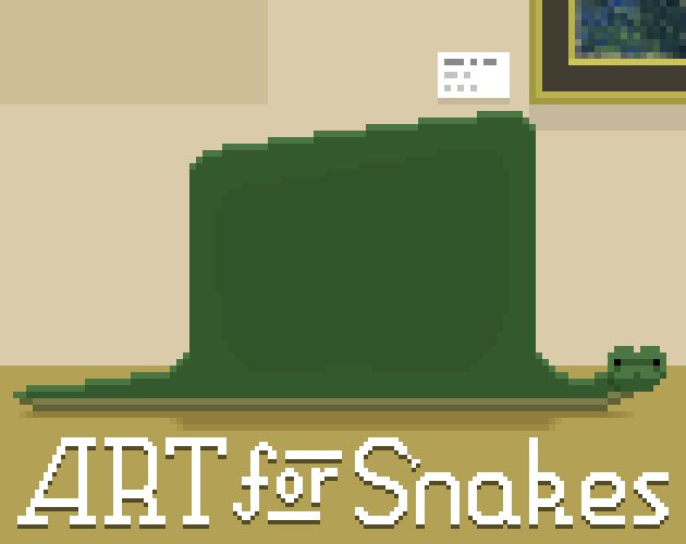
ART for Snakes
Making more art for Snakes
Hi hi! Cheese here again. Wow, what a month! Today we're going to look at some of the art and audio work I did on ART for Snakes.
This post is a follow up to my previous one, which provided inspiration for the project's name change. You can read it over here if you like!
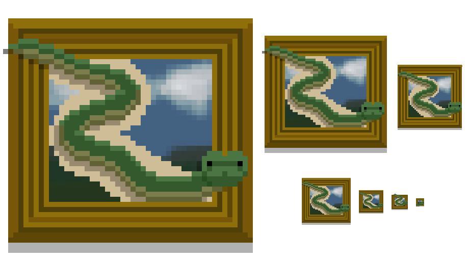
After a little post-jam break to rest up and reflect, we decided that it would be worth expanding Snake Snacks (as it was called then) into something a little bigger. In my mind, the goal was to make a game that reflected what we would have made had we had been available for the full jam duration and had everything go right, starting with an application icon based on the little snake image I'd drawn before going to bed after we submitted jam builds that ended up becoming the cover image here on Itch.
Title screen
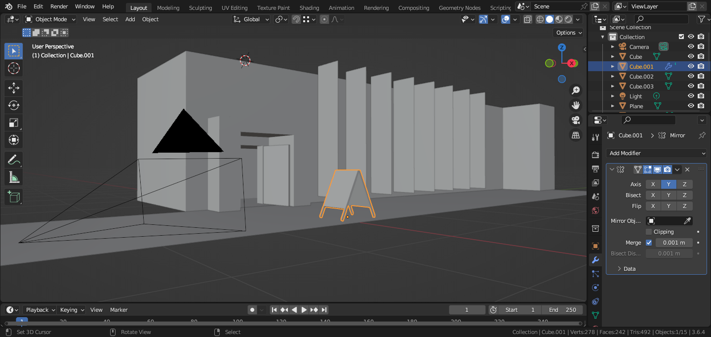
One of the things I'd had in mind, but didn't get time for was a title screen. I liked the idea of a snake looking up at the entrance to an art gallery, and in order to more quickly block out composition and try things, I blocked out something in Blender.
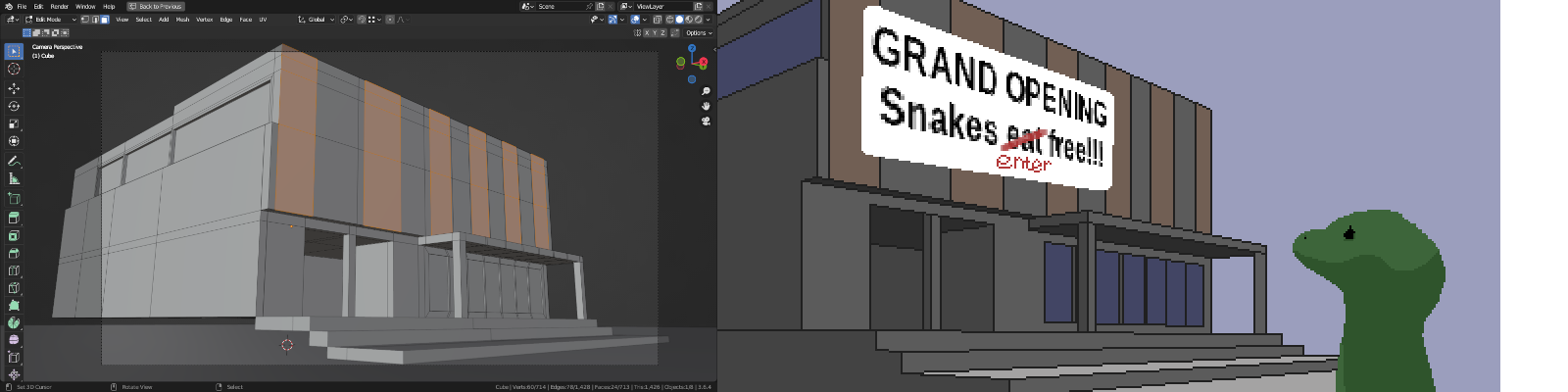
My first attempt ended up looking more like a carpet warehouse than a gallery, and my first snake was... not so good, so I went back to Blender and made something more appropriate, which ended up being the final title screen.
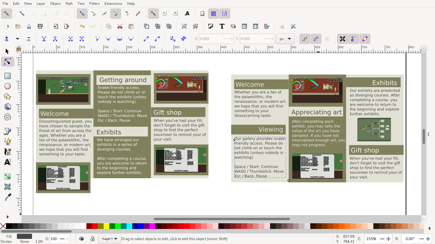
Pamphlet
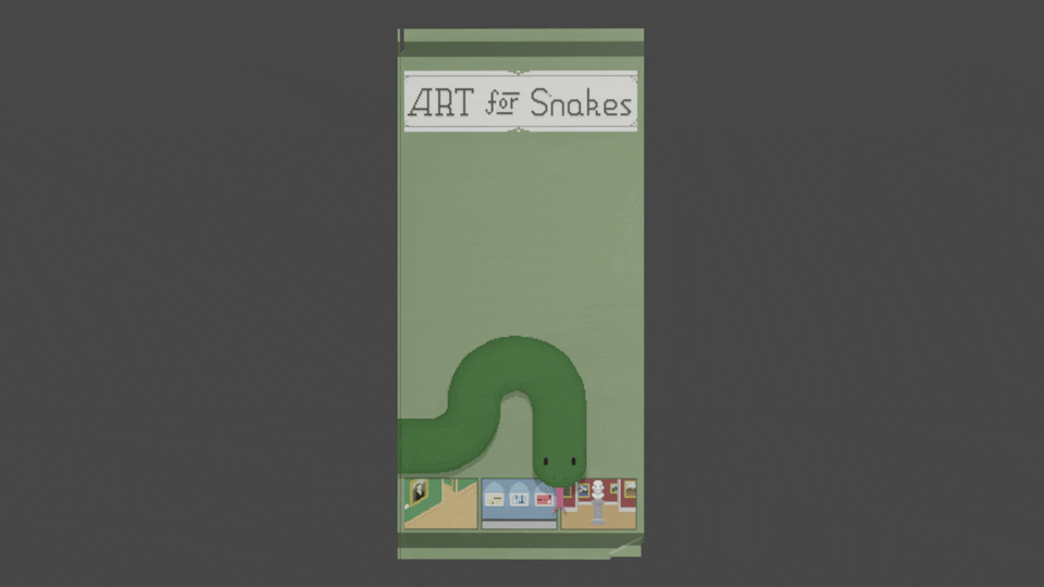
Expanding on the paper we had on the level summary screen, I designed a main menu that looked like a pamphlet that could be folded and unfolded to reveal the level summary screen. Learning to work with polygons was one of Splerp's goals for the projects, so rendering the pamphlet front and back, and distorting those aligned nicely with that.
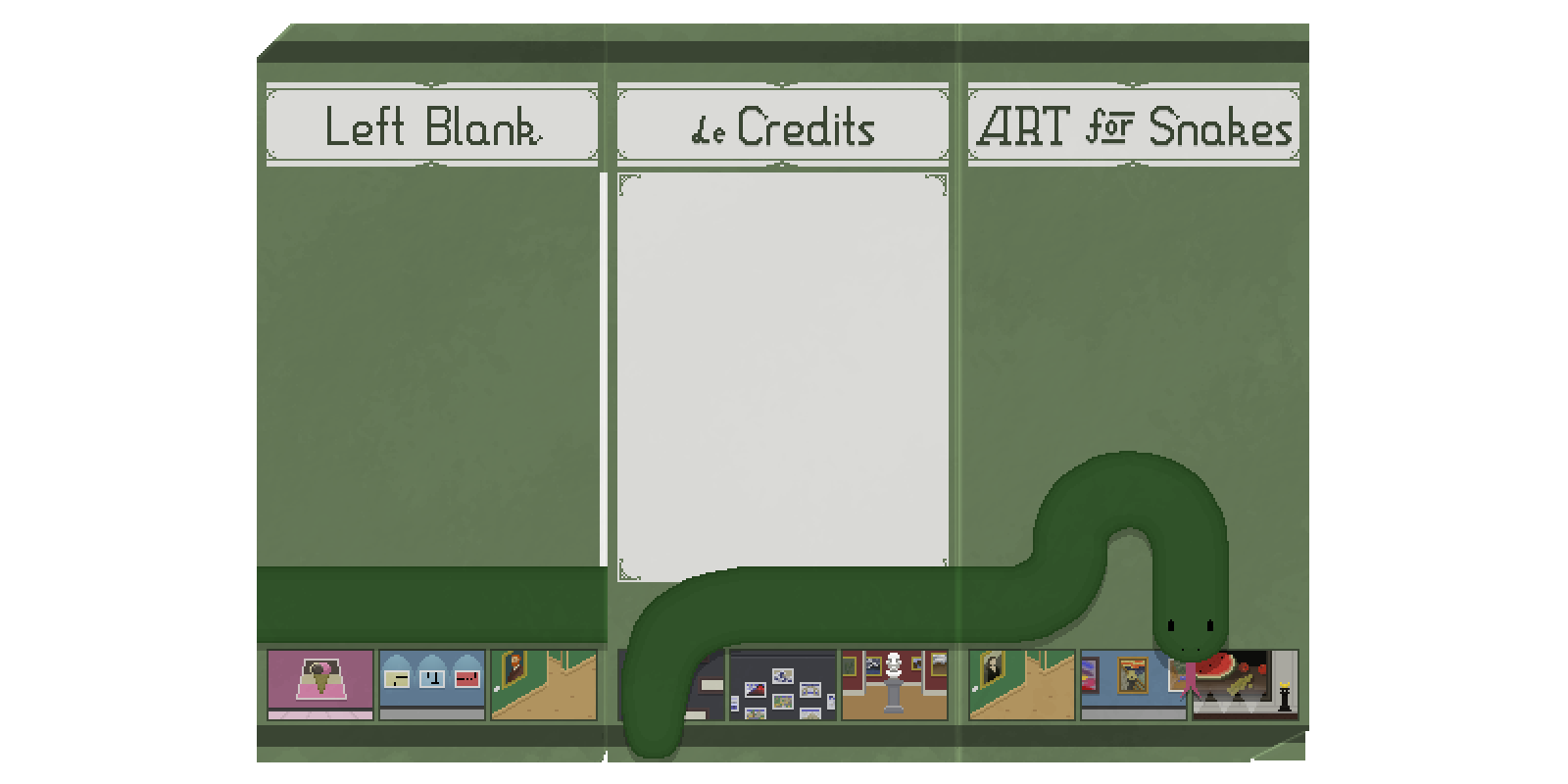
I made a little font I'm calling Fancy Serif for the main menu text, which we ended up using across the game, and also drew out the multi-face title that we've been using for ART for Snakes, with the S having a little snake tongue.

To help give direction for what we were doing with the pamphlet, I did several mock-ups in Blender showing how it might open/close/flip to reveal different screens, which Splerp used as a reference when doing the implementation.
Going from feedback we had on the jam version and keeping in mind that some of the new additions were expanding the complexity of the game, we knew that we'd want to have some sort of instructions screen. I wanted that to be somewhere we could stick a bunch of flavour text too. I blocked out the layout in Inkscape, and then replicated that using in-engine draw functions.
Level select
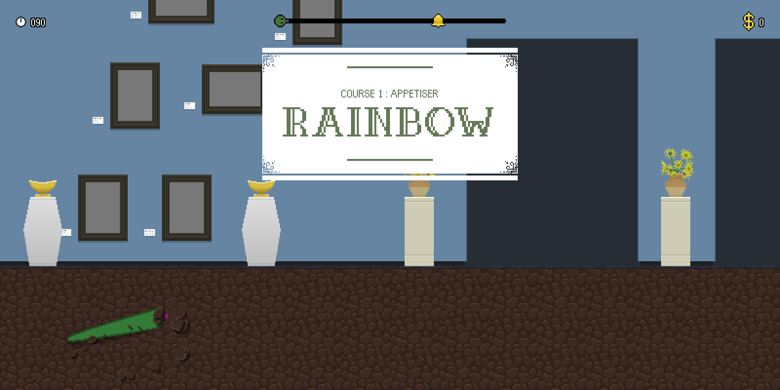
When talking about how to structure the expanded game, we talked about giving players some control over their progression across the game's levels. We had talked about allowing players to use the doorways in levels to choose where they went next, but eventually settled on letting players pick from a map of the museum on the pamphlet. Drawing inspiration from Outrun's course map, we decided that a branching tree structure would be a good way to do, with players only having a choice between two levels at any given branch, but having early choices determine which levels would be available at subsequent choices.
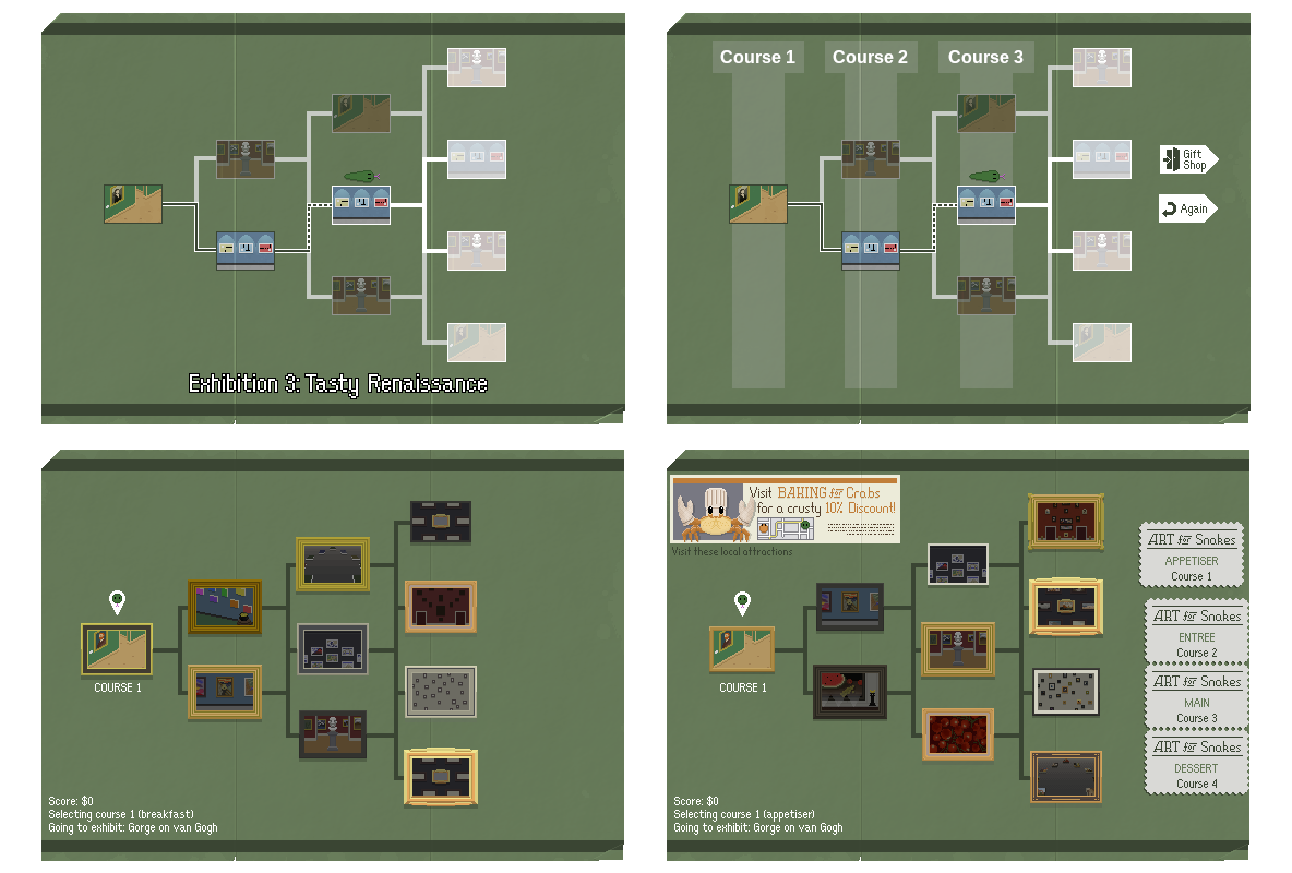
As we got closer to release, this screen was feeling a little bland compared to the rest of the game. When the player gets to the end, they have the choice of ending their run or looping back to the beginning to replay levels or try alternative paths, so we needed to leave space on the right for those options to appear. I added some coupon sprites on the right that indicate which "course" the player is currently on, and get torn off as the game progresses so that at the end there's room for those extra buttons.
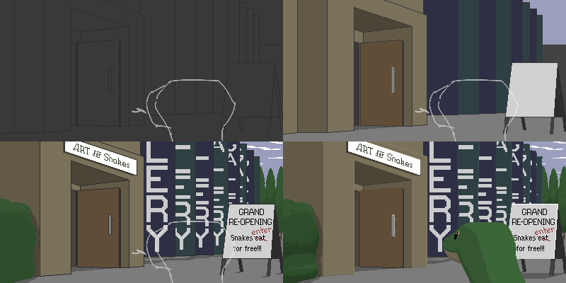
I also added some insets in the top left that are meant to feel like advertisement or notices from other in-fiction attractions that the gallery might have a cross promotion agreement with. I did Baking for Crabs first - originally it was going to be something science themed, but the claws came out looking like oven mitts, so I lent into that. Tardigrade Laserdrome was another early idea I had, but I wanted to prioritise some references to some other games that myself or my collaborators (by this time, lcl had joined to work on the game's soundtrack) had worked on.
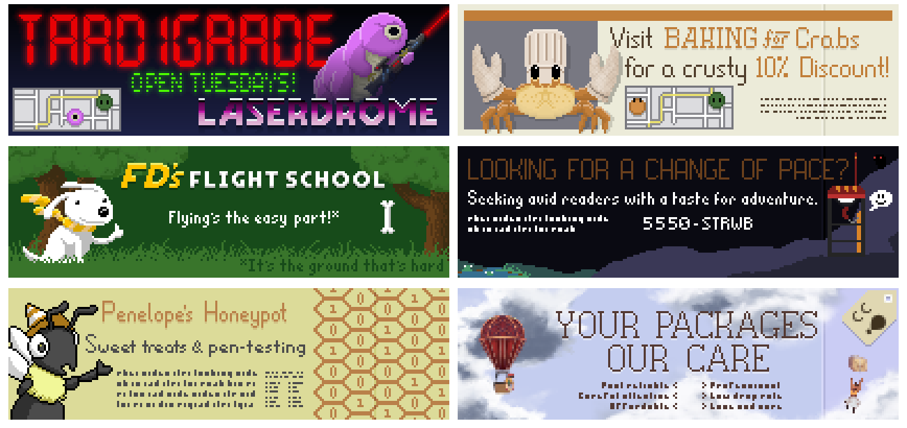
Penelope's Honeypot is a reference to my bee-themed management sim Hive Time (and an infosec pun); the "Looking for a change of pace?" ad is a reference to Splerp's in-development exploration platformer The Owl, the Thief and the Strawberries; the "Your packages, our care" ad is a reference to a jam game I made with lcl called Cloud Courier, and FD's Flight School is a reference to Flying Dog Game, one of Splerp's first games. I had a bunch of fun drawing all these!
Levels
I'd made a few extra backgrounds for the jam version that we didn't get to use, but since the level select screen more or less demanded at least 10 levels, I decided to make a couple more, including a brick one that we didn't end up using.
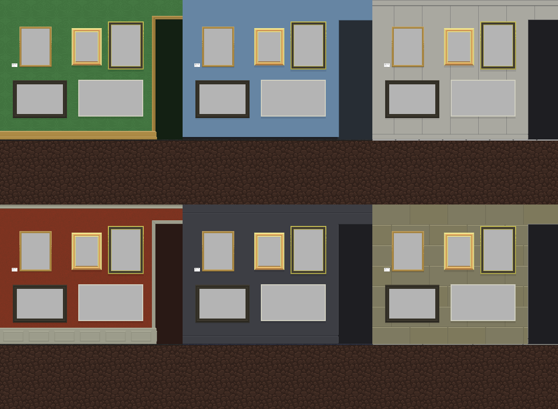
I also made some more flooring sprites to go with the floor boards that we forgot to include in the jam version. Now there's various wooden boards, tiles, cements, and carpets. I don't know what snakes prefer to slither across, but I like to imagine that the variety is appreciated.
The wider range of levels also called for more in the way of non-painting art and stands, so I made a whole bunch of those. I'm really happy with how the fruit basket, treasure chest, and flying machine came out.
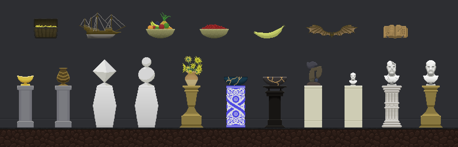
I made some light decorations that we could use to emphasise particular paintings, and some decorations that could be used as frames on non-square art in some levels, such as the arch shaped pieces in Delectable da Vinci and a round frame for one of the miniature portraits in Dainty Morsels.
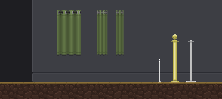
We'd talked about adding curtains that players could climb on and cordons with rope physics, but we didn't end up using them for this update.
For the jam, I'd designed 4 levels (only two made it into the jam version), with each of those starting with the paintings and then thinking about how to lay those out in ways that would ask players to move through them in interesting ways. For the larger version of the game I wanted to do more focused level design, and made 7 more levels (one of which didn't make it into this update), each anchored around different kinds of movement challenges first and foremost.
I think this approach resulted in much stronger levels, but finding the right paintings to fit them was a lot more work than I was expecting. Some came naturally like "Treasure" (which became "Ravenous at Sea") and "Morsels" (which became "Dainty Morsels"), but even for those, there were times where I had expected to be able to find something specific, but wasn't able to - the time saving strategy of using public domain paintings ended up being a double-edged sword!
Editor tools
After the jam ended, I put effort into some basic level editing tools that allow paintings, doors, decorations, non-painting art to be moved around with click and drag actions. Paintings in the art folder can also be dragged and dropped onto the game. I made a bunch of grey placeholders that I used to block out levels, which was much, much faster than writing out the json by hand like I did during the jam!
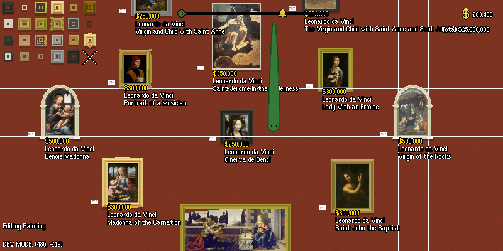
The editor is included in builds, but is entirely undocumented. If you want to fiddle with it, keep in mind that it can edit game files. With debug mode enabled from the settings menu, Right Ctrl enters the editor. F1 through F5 change between editing different entities (F5 also lets you switch between levels). P will write current changes out to file, and Q will reload from disk. Right clicking on a selected painting will allow you to change its frame, similarly right clicking on a selected stand will allow you to pick a different stand/piece of art to go on top.
HUD
In the jam version, the HUD presentation was very quick and dirty. One thing I wanted to change was that the numbers weren't monospaced, and would jump around as you consumed paintings. Splerp tidied that up, and it was a good improvement. Looking at the game as a whole was coming along though, we decided to spruce it up a little more. I made a couple of icons so we could remove a bunch of the text from the HUD and reduced the font size for the remaining numbers a bit.
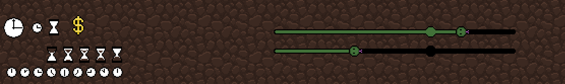
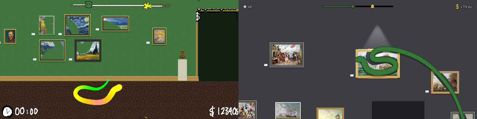
We also decided to make a little progress bar with a bell on it to represent the target rather than just having a numeric value on screen. The result is a lot easier to parse at a glance, and the difference between eating a low value painting and a high value painting is much clearer.
Audio
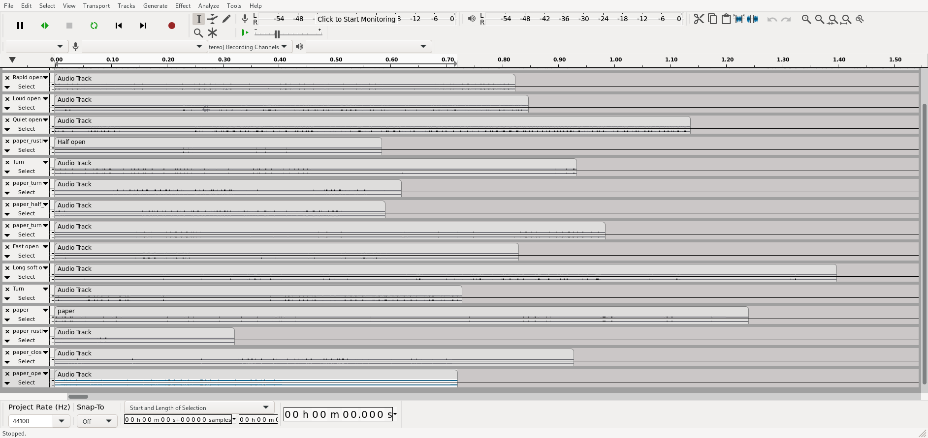
To go along with the updated pamphlet UI, Splerp had found a paper rustling sound that felt right. It was just one though, and to give the right amount of variation to cover the different folds and flips, I recorded a bunch of extra sounds using a pamphlet I'd had lying on my desk for the past several months. I also recorded some mouth sounds for UI select and activate too, which is similar to what I did for Hive Time, and came out well enough here. I also wanted to make a level failed sound that had a similar feel to the mouth sound I made for Hive Time's error sound, but this one came out a little more like an angry walrus - wouldn't have it any other way now that it's in the game, though!
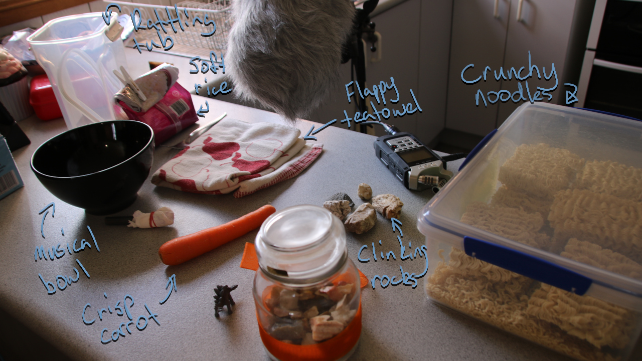
I took a sound I'd recorded for the Bonesweeper prototype's music and sped it up/pitch shifted it to sound like a nice level win sound, and also to sound a little like a dinner bell when crossing the score target. It was nice to find more purpose for those samples. Since the win was feeling a little lacklustre, I also recorded myself doing some polite clapping to go along with it.
I thought I had some fork-being-dragged-through-rice sounds that I'd recorded for the Bonesweeper prototype which could be repurposed for travelling-through-ground in ART for Snakes, but I only had stabby sounds. Splerp recorded some new rice sounds, and I layered and adjusted that down into what you hear in-game now.
I don't get to do a lot of audio work, and it was fun to find ways to take some existing sounds and turn them into something that feels completely different.
Trailer
To help promote the update, I put together a little 30 second trailer and recorded voice over to go with it. Initially I was intending to do something in the style of Richard Attenborough's performance in Jurassic Park, but ended up landing on something that was a mix of the hangman from Robin Hood: Men In Tights and Hedonism Bot from Futurama - there's a blend of silliness and pomp that feels like it fits really well with the game.
I did a bunch of takes though, and for a while was quite taken with one that was weary and disdainful - the idea of someone who has to be a greeter or guide for this stupid art gallery for snakes and hates every second of it is very funny to me.
Gift shop
My favourite new feature in the game is the post-run gift shop. It's something we haven't really talked about or shown off much, so spoilers from here!
I really like giving players opportunities to remember stuff they've experienced. You can see that in the Queen portraits in Hive Time, in the mementos in Away Team, in the unlockable skins in Bat Egg, and so forth. For this game, I liked the idea of having a corny/silly souvenir for each completed level, with the icing on the cake being that you eat them and never get to see them - perhaps drawing a little inspiration from the presentation of the snake puzzle in Curse of Monkey Island.
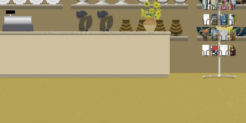
I drew a simple scene that reused some of the non-painting art to suggest shelves upon shelves of knicknacks and reproductions. I also brought back the coupons from the level select screen as an icon for an earned-but-not-yet-revealed souvenir.
Each level has at least 3 souvenirs. At some point during development, I decided that the van Gogh level should probably give fairly normal/straight stuff and allow the zaniness to reveal itself only after a player has progressed a bit. I don't know whether others appreciate this kind of stuff as much as I do, but finding more souvenirs would certainly be a motivating factor for me in choosing to loop instead of going straight to the gift shop.
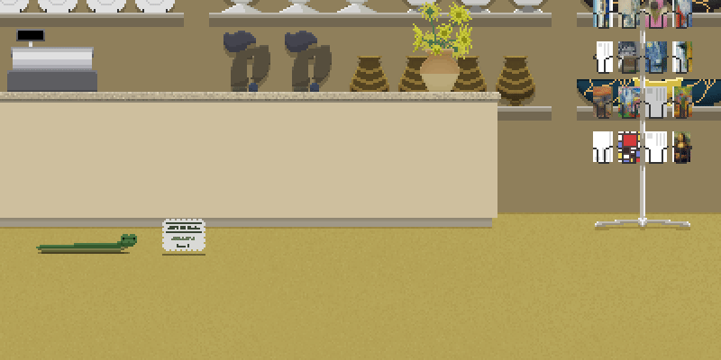
Epilogue level
Last, but not least, we were able to slip the bonus level into this update! The Scream was one of the first paintings Splerp suggested when we came up with the idea of populating the gallery with public domain art, and at some point while testing stuff, we had a level that had The Scream repeated a couple times. The thought of a level entirely populated by The Scream was funny to me, so I decided to turn it into a little easter egg level that appears after the gift shop *if* you've completed 4 or more levels.
I painted an ice cream cone to put in the middle and surrounded it in The Screams of various sizes, calling the level "I Scream, You Scream." I'd added "(possible forgery)" to the painting titles and we took a little time across development to make our own versions of The Scream to slip in there. Splerp painted a version on canvas in acrylic and another low res version in Krita. I did a tiny pixel art version, a vector version in Inkscape, a Piet Mondrian inspired version in Inkscape, and a ton of glitched/modified versions of the original. The final level is huge and wonderful.
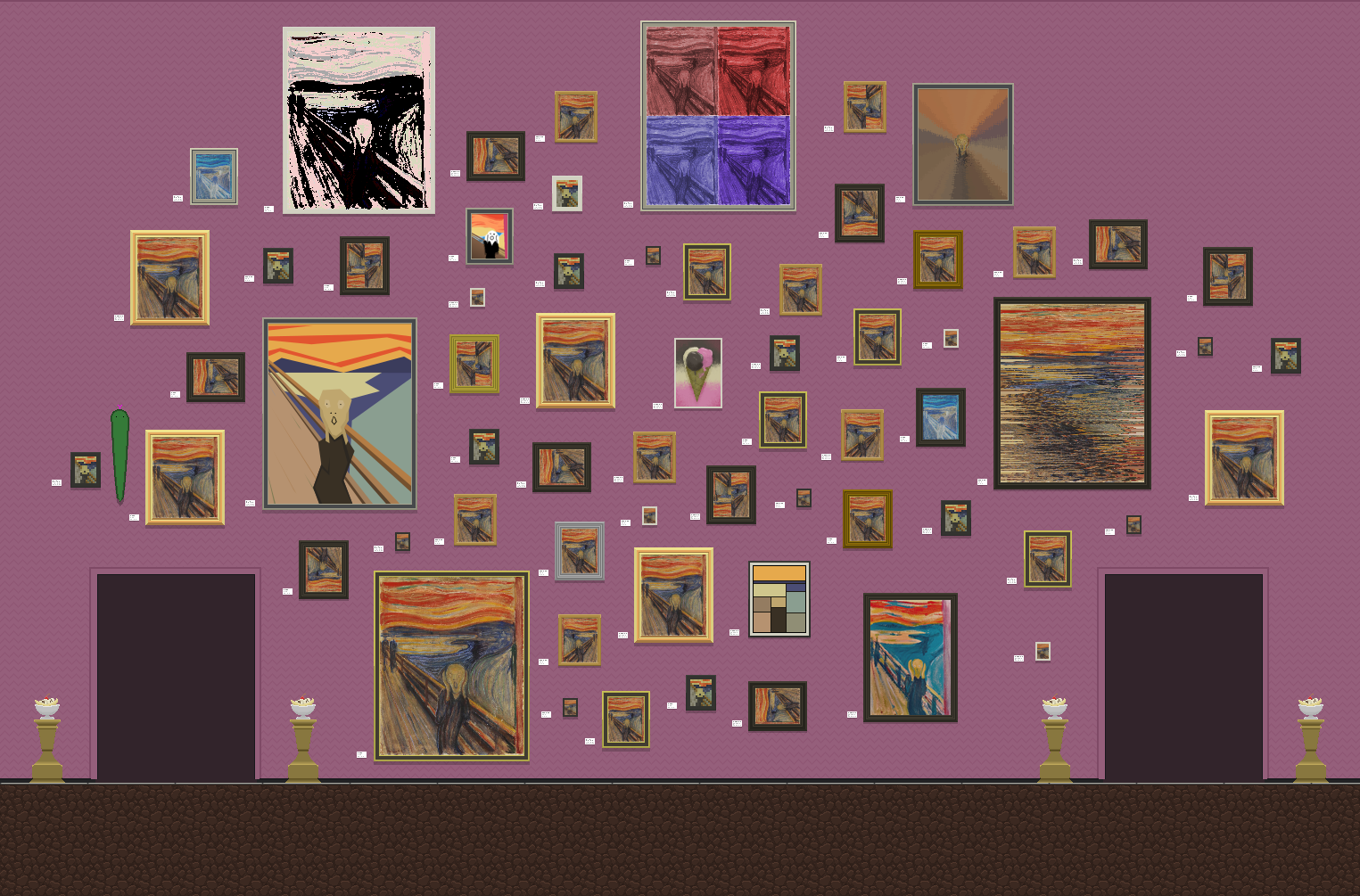
It's a silly joke wrapped in this big and slightly disconcerting celebration of an iconic piece of art - a combination that in a light hearted way, maybe invites us to reflect on the relationships societies, cultures, and individuals have with art that is seen as significant.
If anything sums my feelings about the essence of ART for Snakes, it's that.
Leave a comment
Log in with itch.io to leave a comment.